How to make wedding program fans
I first designed our wedding programs months ago while playing around in Microsoft Publisher (and later bought it for my personal computer). Wedding program fans seemed kind of necessary because of the heat, but I wanted a certain degree of continuity with the invites. My original designs included the damask pattern from the invitations. The damask moved from the sides to the top and bottom allowed for bigger and easier to read font.
For some reason, I just couldn’t commit to any of these designs. They just didn’t quite seem right. The week of the wedding, I changed everything. Instead of the damask, I decided to mimic the maroon sash from the invitation.
If you noticed, I moved our names and last initial to this banner, and I split the ceremony around it. On the back, our wedding date was moved from the bottom to the banner. Everything else stayed the same. I added the thick border in a late-night moment of inspiration.
How to design wedding program fans
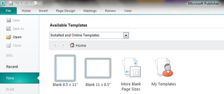
- Open a blank document in Microsoft Publisher. Mine is landscape 8.5×11.
- Insert a line dividing the paper in half vertically (at 5.5 inches) to serve a guide during assembly. Change the color to light gray and adjust the line weight.
- Next, insert a blank rectangle and fill it in (ours is maroon). Center it vertically and extend it across both sides of the program.
The front of the programs
- Create a text box for your names and the monogram initial. Type your first name, middle name, and last name on separate lines. Change to the font of your choice (ours is Amazone) and the largest size to stay in the margins. Center all text.
- Move the names and initials on top of the colored box. Bring the text to the front. Change the text color to white (or whatever color you want). Remove the shape outline.
- Add another text box for your wedding service. You can also make separate text boxes for above and below the colored box. I chose to put our music and reading selections one font size smaller. Inserting a line shift (SHIFT + ENTER keys) ensures that you won’t have extra space between lines. Be sure to center it between the border!
- Copy and paste the colored box and border from the front. Insert a text box with your wedding date or whatever you would provide.
The back of the programs
- From there, move to the back of the program. Insert two blank text boxes on the back and type up your wedding party. Again, our people’s names are a font size smaller than their titles and are separated with a line shift. Center these boxes.
- Create your final text box. We included a thank you note from us on the back of the programs. If you’re feeling creative, throw in a photo, a crossword about y’all, or bridal bingo.
- Now to the outer border: insert a rectangle shape along the blue Publisher border. Change the shape outline to the same color as your middle box. Adjust the weight to whatever thickness you like. We picked a 6 point weight.
Double check your spelling and names. You’re ready to print! We took ours to Kinko’s after a major printer catastrophe. If you want to make your own programs, have them professionally printed! It’s worth the money to avoid a bridal meltdown. Next, we assemble.
Gather your closest friends and family who came in early for the wedding. These can include, but are not limited to: the bride, the groom, your parents, your in-laws, your brother-in-law, his girlfriend, your mom’s best friend from college who flew in from Colorado, and your grandfather-in-law. Pass out assorted tools that include wooden spoons and cookie sheets.* A scoring board or two, bone folder, corner rounder, tape runners, and craft sticks are also a plus.
How to assemble your wedding program fans
- Score along the thin, light grey line running down the paper center on the non-text side.
- Crease with a bone folder then round the program corners.
- Apply tape to the whole of one craft stick and half of another and press to the program. Two craft sticks will keep your fan more rigid and better at cooling.
- Run tape along the border of one side of the program. Line up the corners and press down. Smooth out any corners or bumps.
- Finally, admire your handiwork. Realize you still need to make 90-ish more. Continue working. Drink some wine.
*The wooden spoon was used to punch the corner rounder while the cookie sheets were used for creasing the programs.


